What happens when a computer can’t display characters in a particular font? You see this placeholder instead – – lovingly (or loathingly) called “tofu” by developers. Google’s aim was to banish the placeholder for good, which is why its new font is known as “Noto”, or “no more tofu”.
From Arabic to Yi
Together with linguists, cultural experts, and the font and technology specialists Monotype, Google has spent five years developing Noto. Every character has been carefully designed in order to achieve a harmonious look that works for all the world’s languages and writing systems. Noto was first introduced in October 2016.
So what does the open-source font offer? Nothing less than 110,000 characters from more than 800 languages, both living and historical, capable of representing 100 different writing systems – and all according to Unicode standard 6.0. It enables digital representation for languages from every continent, whether major or minor, and also integrates newer characters such as emojis. The next design phase will cover character sets up to and including Unicode 9.0.
IKEA now uses Noto
Noto is available in serif and sans serif variants. Last summer, the latter caught the eye of IKEA, and the Swedish furniture giant quickly changed its corporate design to make Noto the house font – as showcased in its 2020 product catalog. With this new design, IKEA is taking a big step towards the inclusion of global markets. Just like the 4.2 million other websites worldwide now using Noto.
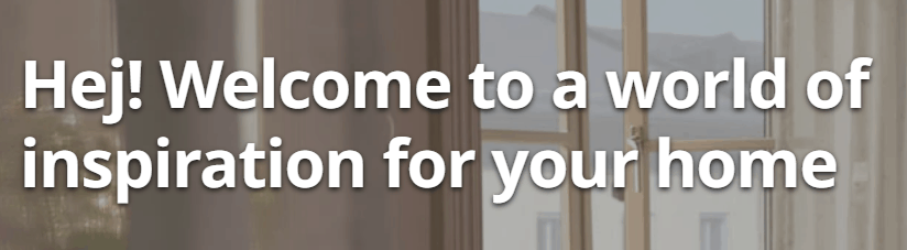
Ikea.com, screenshot via Supertext
Not a fan of tofu either? Download Noto for free here.
Cover image via Tenor