
There are three main things to bear in mind when preparing to make an app available on a new market: content translation, technical issues, and cultural adaptation. We already know that it’s not enough to just translate a text. Now, let’s look at why good localization doesn’t happen quickly either. Have you encountered any of these kinds of rush jobs?
Layout lapses
This problem frequently occurs during the traditional localization process, where an application is first programmed in one language and then subsequently translated. This means that the translations are subject to length restrictions – and because some languages are wordier than others, things can quickly get cramped. Overlapping sections, line breaks in the wrong places… If you don’t make sure to carry out a final layout check, you can get results like this:
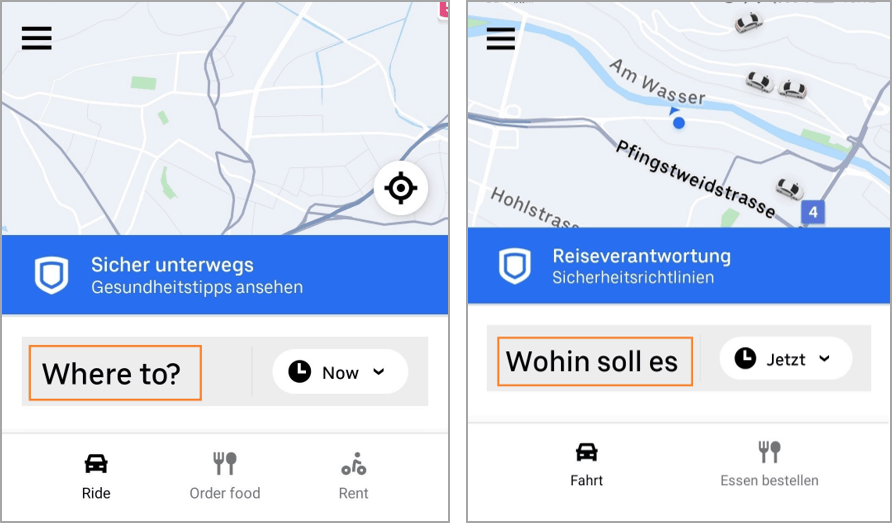 (The German should say “Wohin soll es gehen?”– a whole word and the question mark is not displayed.)
 (The line break is in the wrong place.)
Localization liabilities
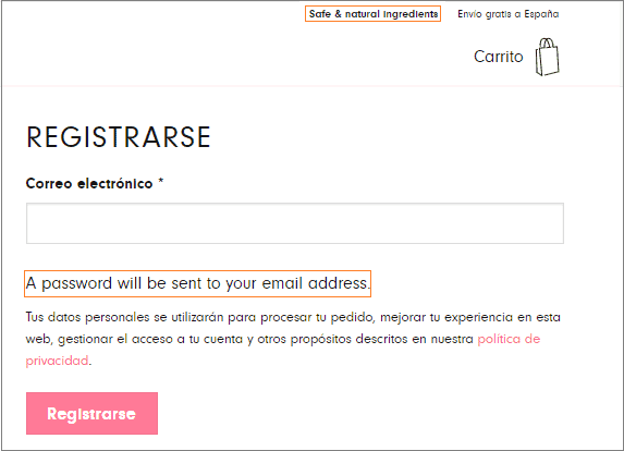
Localization involves translation, sure, but it doesn’t mean you have to translate every last little thing. Sometimes, it’s better to leave a term in the original, particularly when it comes to the navigation. The English word “Home”, for example, is now common in tech across many languages, so a professional localizer will rarely translate it. When they do – as in this German example – it’s often more confusing than helpful for users.

Design disasters
Good user experience doesn’t just depend on easy-to-understand content. Design elements such as color, images and symbolism are also key. If these don’t suit the new market, the website or app is unlikely to be a success – as Amazon discovered in 2017 when it set out to conquer China. The company painstakingly translated each and every snippet of text on its site… but forgot to consider that the Chinese market is used to flashier designs than the US one: just take a look at Alibaba or Taobao. The result: Amazon’s traditional western design failed to wow Chinese consumers.

Amazon website

Taobao website
String screw-ups
A classic of the localization error genre. Even the most thorough analysis of a site’s main and subpages will usually miss a few minor text elements. But why? Taking a site international means translating text “strings”, which are stored across countless files on a range of different servers. It’s certainly easier than combing through the source code in search of elements to translate, but the process presents its own dangers: strings can easily be combined in the wrong order or missed out entirely. Fixed elements are particularly susceptible to errors, and though they may be small, they’re the kind of thing that users will immediately spot:
In conclusion, it’s clear that most common localization errors only become visible in context. Luckily, this means they can easily be avoided by rigorous UX testing and workflows that keep localization in mind right from the design stage. More haste, less speed – so take your time. Or let us do it for you.
Cover image via Unsplash